
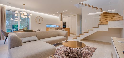
Is ‘Greige’ Really All the Rage?
Personally, I can’t stand greige. I mean, in one sense, I’m completely engaged and in agreement with the greige rage. The semi-distinct tone that exists between gray and beige has a useful calling card as a color that is “neutral without being boring.” For this reason alone, I understand the purpose and popularity of greige as a color choice for home staging. It has the potential to attract the greatest number of potential buyers, while also finding a few that will fall in love with the home and the color scheme that supports it. But as a decorating style, it’s not my cup of tea, to put it charitably.
Here’s my beef: Neutral without being boring is simplistic, which isn’t bad in itself, but it also exists in a no-man’s-land between featured highlight and background relief. It doesn’t know what it wants to be, and it’s not as easy in my opinion to find great wall hangings that work well with greige. It’s easy for a potential home buyer to imagine all the things they could do with a greige-colored wall. It’s hard for them to actually find the perfect something and execute a decision that works as well as their vaguely colored vision. (Okay, no more rhymes now…I mean it.)
Upon further review
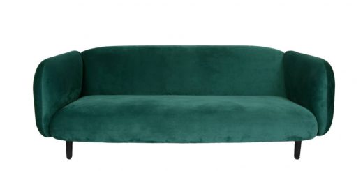
Truth be known, I’m not quite as harsh on greige as I sometimes pretend, even in my own personal tastes. It’s the hype that’s gotten out of control. I think it works best, if it’s going to work at all, as a two-tone color scheme or with three-quarter molding. Actually, just as important as the spatial ratios is the statement made by the other color. It’s sort of a one-two punch in which the greige is able to hold its own even as the supporting color.

Recent Comments